Introduction to Data Visualization Tools
In today’s world, where data holds significant importance, the ability to interpret and communicate insights is crucial. Data visualization tools play a vital role in transforming raw data into meaningful visuals, aiding in comprehension, analysis, and decision-making. These tools offer a range of features, from basic charting functionalities to advanced analytics and interactive dashboards. In this article, we will explore the fundamentals of data visualization tools, discussing their importance, common features, and popular examples.
This article provides a comprehensive introduction to data visualization tools, equipping you with the knowledge to choose the best option for your needs. We’ll delve into:
- What is Data Visualization?
- Why is Data Visualization Important?
- Common Features of Data Visualization Tools
- Types of Data Visualization
- Popular Data Visualization Tools
- Comparative Analysis of Data Visualization Tools
- Selecting the Right Visualization Tool
- The Crucial Role of Data Visualization in Different Fields
- Emerging Trends in Data Visualization
- Challenges and Future Trends

What is Data Visualization?
Converting data into visual representations like graphs, maps, and charts is the art and science of data visualization. These visual aids make it easier to comprehend complex information and identify patterns or trends that may not be visible in raw data.
Tools for data visualization, including Tableau, Power BI, and D3.js, are essential to this process since they offer platforms for making intelligent and interactive representations. These technologies enable users to do data exploration and analysis, effectively communicate results, and make data-driven decisions that have a significant economic impact.
Both people and companies may fully utilize their data by utilizing data visualization tools. With the help of these tools, users may monitor important indicators, find actionable insights, and tell stakeholders’ and decision-makers’ stories using data. Data visualization technologies enable users to derive insights from data and inspire plans and actions through the creation of dynamic dashboards, interactive charts, and geographic representations.
Why is Data Visualization Important?
Data visualization is crucial for several reasons, playing a fundamental role in various aspects of data analysis, decision-making, and communication. Data visualization is essential for various fields, offering numerous benefits.
Here’s a glimpse of its impact:
- Enhanced Understanding: Data sets can be complex and overwhelming. Visualizations break down information into easily understandable formats like charts, graphs, and maps, allowing us to identify patterns and trends that may go unnoticed in raw data.
- Improved Communication: Data visualizations serve as a bridge between technical experts and non-technical audiences. They present complex information in a clear and concise manner, fostering better communication and data-driven decision-making.
- Identification of Trends and Anomalies: Visualizations excel at highlighting trends and outliers within data. This enables users to identify potential issues, track progress over time, and make informed predictions.
- Effective Storytelling: Data visualizations are powerful tools for storytelling. They have the ability to convey complex ideas and narratives in a visually engaging way, capturing the attention of the audience and conveying the message effectively.
Data visualization has become increasingly important for businesses in various industries. It is no longer limited to data experts, as businesses now use it to understand customer behavior, track marketing campaigns, analyze sales performance, and improve operations.
Data visualization tools play a crucial role in bridging the gap between data and understanding. They allow users to present complex information in a visual format that is easy to comprehend, interpret, and communicate. These tools use charts, graphs, maps, and infographics to provide deeper insights, identify patterns, and tell stories. They also help uncover trends, correlations, and outliers that may be hidden within large datasets.
One of the key advantages of data visualization tools is their ability to enhance decision-making processes across various fields. Whether in business, academia, healthcare, or public policy, visualizing data allows stakeholders to quickly gain valuable insights, leading to more informed decisions and strategies. Additionally, these tools promote transparency and collaboration by enabling users to share interactive visualizations with teams or the public, fostering a culture that values data-driven approaches.
Common Features of Data Visualization Tools
Data visualization tools come with a variety of features that are commonly found across different platforms.
These functionalities include:
1. Chart Types: These tools provide a wide range of chart types, such as bar charts, line graphs, pie charts, scatter plots, heat maps, and more. This allows users to choose the most suitable visualization for their data and analysis needs.
2. Customization Options: Users have the flexibility to customize their visualizations according to their specific requirements and preferences. They can easily adjust colors, fonts, labels, axis scales, and other visual elements to improve clarity and aesthetics.
3. Data Import and Integration: These tools seamlessly integrate with various data sources, including spreadsheets, databases, APIs, and cloud storage platforms. This ensures easy connectivity and synchronization of data.
4. Interactive Capabilities: Interactivity enhances data visualizations by enabling users to dynamically explore and interact with the underlying data. Features like tooltips, zooming, filtering, and drill-down functionality enhance user engagement and comprehension.
5. Collaboration and Sharing: Collaboration features are often included in data visualization tools to facilitate teamwork and knowledge sharing among users.
6. Advanced Analytics: Some advanced data visualization tools include analytical features like predictive modeling, statistical analysis, trend forecasting, and machine learning algorithms. These capabilities allow users to gain deeper insights and discover patterns that may not be immediately apparent through basic visualization alone.
Types of Data Visualization
There are various techniques and methods available for visualizing data, each tailored to different types of data and analytical tasks.
Some commonly used types of data visualization are:
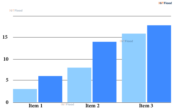
1. Bar Charts: These charts are simple and widely used. They use rectangular bars to represent data, where the length of each bar corresponds to its value. Bar charts are great for comparing categorical data or showing changes over time.
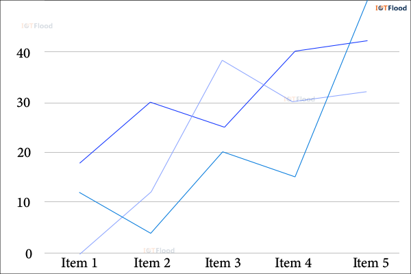
2. Line Charts: Line charts are ideal for visualizing trends and patterns over time. They connect data points with lines, making it easy to observe continuous changes in values. Line charts are particularly useful for tracking performance metrics or analyzing time-series data.
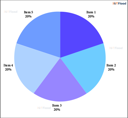
3. Pie Charts: Pie charts represent data as a circle divided into slices, with each slice representing a proportion of the whole. They are effective for displaying the distribution of categories within a dataset. However, it is important to use pie charts sparingly as they can be challenging to interpret accurately, especially with multiple categories.
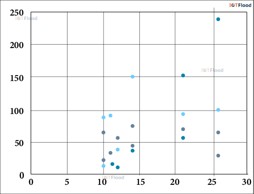
4. Scatter Plots: Scatter plots are used to visualize the relationship between two variables. They provide a visual representation of how the variables are related to each other.
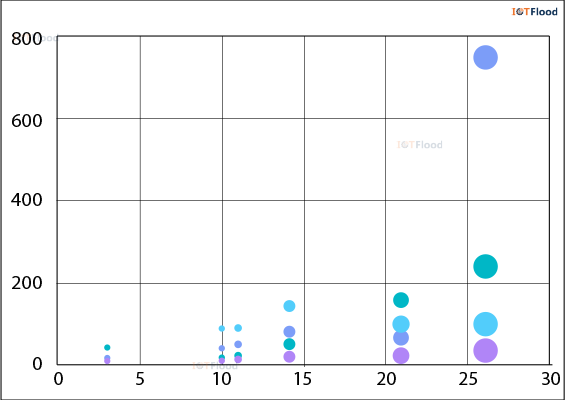
5. Bubble Charts: Bubble charts are commonly employed to depict three-dimensional data. In this type of chart, the x-axis represents one variable, the y-axis represents another variable, and the size of the bubbles represents a third variable. These charts prove to be valuable tools for emphasizing patterns and relationships within datasets that have multiple dimensions.
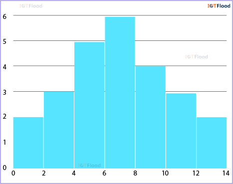
6. Histogram: Histograms are visual representations that show how numerical data is spread out. They group the data into different sections and show how many data points fall into each section using bars. Histograms are great for understanding how continuous data is distributed and what the average values are.
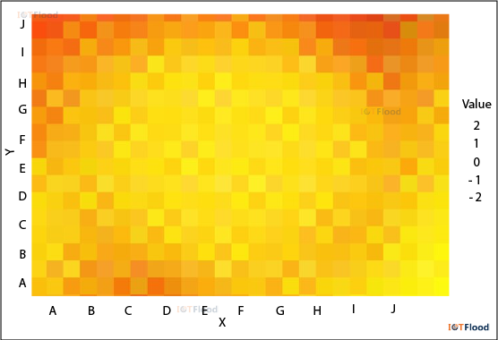
7. Heat Maps: Heat maps, on the other hand, use colors to show how dense the data points are in a two-dimensional area. They are commonly used to display geographic data or to emphasize areas with either high or low concentration in a dataset.
Popular Data Visualization Tools
There are several data visualization tools available on the market to cater to different types of users, ranging from beginners to advanced analysts.
Here are four popular examples, each offering their own unique features and strengths:
1. Tableau: Tableau is a leading data visualization platform known for its user-friendly interface and powerful analytics capabilities. It provides a drag-and-drop interface for creating interactive dashboards, charts, and maps. Tableau supports various data sources and offers robust collaboration features for sharing insights within teams.
2. Microsoft Power BI: Microsoft Power BI is a comprehensive business intelligence tool that allows users to visualize and analyze data from multiple sources. It provides pre-built templates, customizable dashboards, and the ability to query data using natural language. Power BI seamlessly integrates with other Microsoft products and services, making it a popular choice for organizations already using the Microsoft ecosystem.
3. Google Data Studio: Google Data Studio is a cloud-based tool that enables users to create interactive reports and dashboards. It integrates smoothly with Google’s suite of products, such as Google Analytics, Google Sheets, and BigQuery. Collaboration is a key focus of Google Data Studio, allowing multiple users to edit and view reports in real-time.
4. D3.js: D3.js is a JavaScript library designed for creating custom and interactive data visualizations on the web. It provides developers with powerful capabilities to manipulate DOM elements based on data. D3.js offers a high level of flexibility and control over the design of visualizations, making it a preferred choice for developers who value versatility and extensibility.
5. Sprinkle Data: Users can easily explore, analyze, and display data from a variety of sources using Sprinkle Data’s user-friendly data visualization platform. Users may find hidden patterns and connections with the aid of its sophisticated analytics tools and user-friendly UI. Sprinkle Data is perfect for companies looking to use data visualization to make educated decisions since it also provides real-time data updates, collaboration features, and easy connection with common data sources.
6. Metabase: For users without prior SQL experience, Metabase is an open-source business intelligence application that makes data exploration and visualization easier. It is well-liked by small and medium-sized enterprises because to its simple setup and compatibility for several data sources. With the use of real-time dashboards, custom filters, and ad hoc searches, Metabase users can easily produce and disseminate insights.
7. Superset: It is an additional open-source platform for data visualization and exploration that was created by Airbnb. Along with integrating with well-known data warehouses like Apache Druid and Apache Hive, it offers a variety of visualization choices. Superset’s SQL editor and exploration features enable customers to effectively construct interactive visualizations and disseminate findings within their business.
Comparative Analysis of Data Visualization Tools
When it comes to data visualization tools, there are a few key factors to consider, such as ease of use, features, scalability, and cost. Let’s take a look at four popular options and see how they measure up against each other:
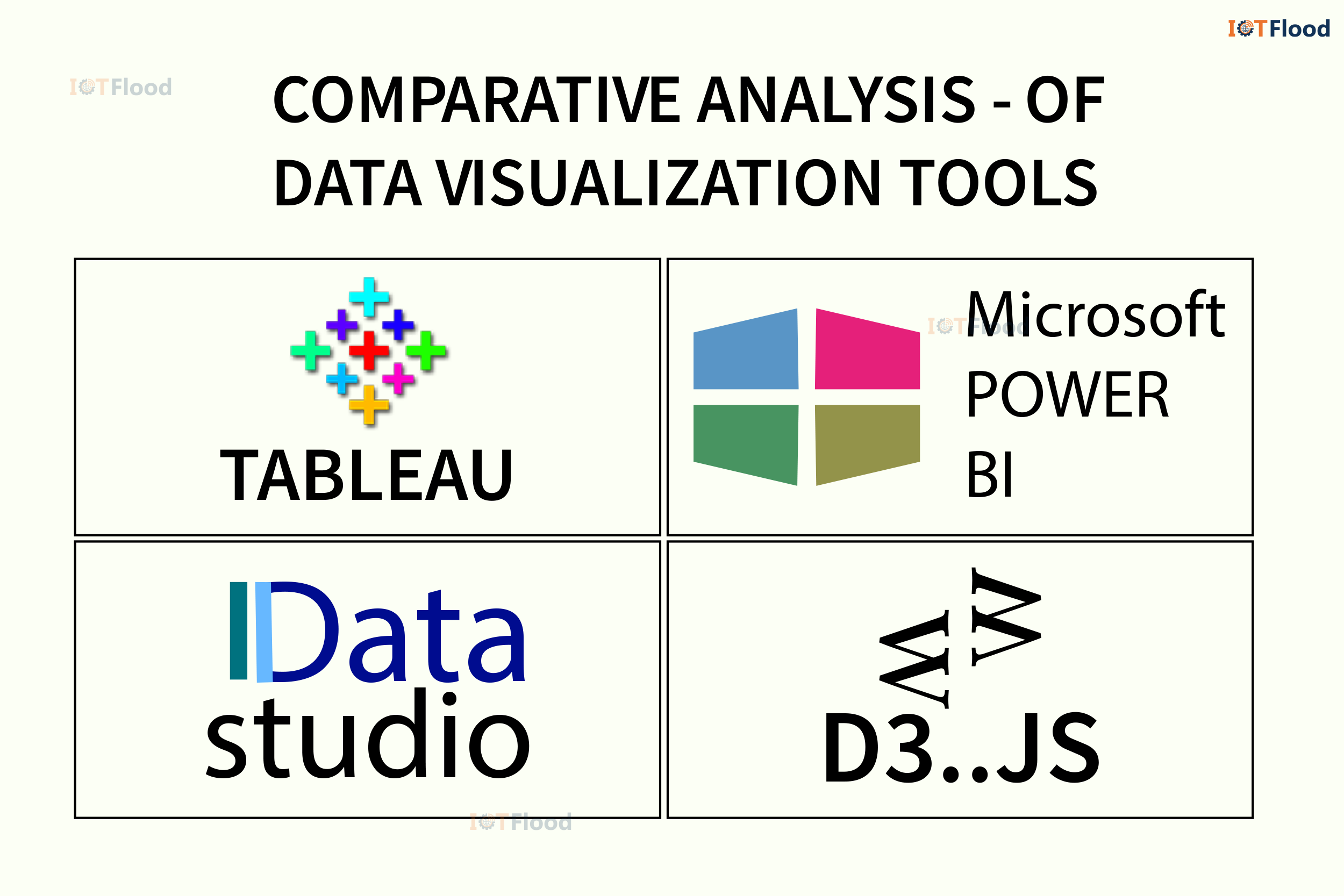
Tableau:
Advantages: The interface is user-friendly, offering a wide variety of chart types and robust analytics capabilities.
Disadvantages: Enterprise editions can be costly, and complex analyses may require a bit of a learning curve.
Suitability: This tool is great for organizations that need advanced analytics and interactive dashboards.
Microsoft Power BI:
Advantages: It seamlessly integrates with the Microsoft ecosystem, allows natural language querying, and offers customizable dashboards.
Disadvantages: Compared to Tableau, customization options are somewhat limited, and there can be occasional performance issues with large datasets.
Suitability: This is the perfect choice for businesses already using Microsoft products and seeking a comprehensive business intelligence solution.
Google Data Studio:
Advantages: It’s free to use, offers cloud-based collaboration, and integrates smoothly with Google products.
Disadvantages: Advanced analytics capabilities are limited, and there are fewer customization options compared to premium tools.
Suitability: This tool is a great fit for small to medium-sized businesses in need of a cost-effective visualization solution.
D3.js:
Advantages: It’s highly customizable, open-source, and supports complex visualizations.
JavaScript and web development skills are essential. This is a great fit for developers and designers who want complete control over how visual designs and interactivity are implemented.
Disadvantages: Due to its vast capabilities and the need for an awareness of JavaScript and data visualization principles, there is a steep learning curve, especially for novices.
Suitability: Excellent for producing personalized and interactive data visualizations for the web, providing developers with a wide range of options and granular control.
Sprinkle Data:
Advantages: It has the advantage of providing real-time data updates, collaboration tools, and simple connection with popular data sources, which makes it perfect for well-informed decision-making.
Disadvantages: Its drawback is that, in comparison to more specialist data visualization systems, it could not provide as many complex customization choices.
Suitability: Excellent for companies and groups looking for an easy-to-use platform to explore, analyze, and visualize data from many sources without requiring a lot of modification.
Metabase:
Advantages: One benefit of Metabase is that it makes data exploration and visualization easier for people who don’t know SQL, making it user-friendly and accessible.
Disadvantages: Compared to more sophisticated BI products, Metabase could not offer as much flexibility or deep analytics.
Suitability: Perfect for teams and small to medium-sized enterprises looking for a simple, easy-to-use BI platform for producing insights and interactive dashboards.
Superset:
Advantages: It has a variety of visualization choices, interacts with common data warehouses, and has SQL capabilities for advanced data research.
Disadvantages: One drawback of Superset is that it requires technical know-how to set up and configure, which might be difficult for non-technical users.
Suitability: It’s perfect for technically equipped teams and organizations who are data-savvy and want a flexible platform for data analysis and visualization.
Selecting the Right Visualization Tool
After completing data cleaning, the next step is to choose the most appropriate visualization tool. There are many options available, both free and paid, to suit different needs and skill levels. These range from basic spreadsheet software with built-in charting features to specialized platforms for data visualization.
The decision on which tool to use depends on several factors, such as the complexity of the data, visualization requirements, interactivity, and desired output formats. Some tools are great for exploratory data analysis, allowing for quick generation of various visualizations to gain insights. Others focus on creating polished visualizations that are ready for publication, with advanced customization options.
When selecting a visualization tool, it is important to consider the learning curve and the availability of resources and support. Some tools require programming skills and have a steep learning curve, while others have a user-friendly interface that allows for drag-and-drop functionality. Additionally, it is helpful to explore the different types of visualizations that can be created with each tool.
From bar charts and line charts to scatter plots, heatmaps, and network diagrams, there is a wide range of visualization options to choose from. Increasing the effectiveness of conveying insights derived from data is of great importance. When choosing a data visualization tool, there are several key factors to consider.
Here are some aspects to look for in a data visualization tool:
- User-Friendly Interface: It is crucial to have an interface that is easy to use, especially for individuals with different levels of technical expertise. Look for tools that offer simple drag-and-drop functionality, clear navigation, and a minimal learning curve.
- Customization Options: The ability to customize visualizations to meet specific needs and preferences is essential. Make sure the tool provides ample options for adjusting colors, fonts, labels, axes, and other visual elements.
- Compatibility and Integration: Consider the tool’s compatibility with different data sources and its ability to seamlessly integrate with existing workflows. Look for tools that support various file formats, databases, APIs, and popular software platforms.
- Scalability: As datasets become larger and more complex, the tool’s scalability becomes crucial. It is important to ensure that the tool can efficiently process and visualize large volumes of data without sacrificing performance.
- Interactivity: Interactive features enhance user engagement and allow for dynamic exploration of the data. Look for tools that provide interactive capabilities to enable users to interact with and explore the data in a meaningful way.
- Advanced Analytics: To gain deeper insights and analysis, explore tools that incorporate advanced capabilities like predictive modeling, statistical analysis, trend forecasting, and machine learning algorithms.
- Collaboration and Sharing: Features that promote teamwork and knowledge sharing are important. Seek tools that support real-time collaboration, annotations, and easy sharing of visualizations with teams or external stakeholders.
- Support and Documentation: Troubleshooting and mastering the tool requires adequate support resources like documentation, tutorials, and community forums. Ensure the tool offers comprehensive support options.
- Cost and Licensing: Evaluate the cost structure and licensing options, including upfront fees, subscription plans, and additional features. Select a tool that aligns with your budget and licensing requirements.
- Security and Compliance: When handling sensitive or confidential information, prioritize data security and compliance with privacy regulations. Choose tools that adhere to industry standards and provide robust security features.
By carefully considering these factors and conducting thorough research, you can make an informed decision and select a data visualization tool that precisely meets your needs and objectives.
Crucial Role of Data Visualization in Different Domains
Data visualization plays a vital role in a wide range of areas, enabling professionals to extract valuable insights, convey discoveries, and influence decision-making. Here’s how data visualization is applied in various domains:
- Business and Finance: Within the business realm, data visualization tools assist in financial analysis, sales prediction, market research, and performance monitoring. Executives can use interactive dashboards to monitor key metrics in real-time and identify areas for enhancement.
- Healthcare: Data visualization aids clinicians and researchers in analyzing patient data, tracking disease outbreaks, and monitoring healthcare outcomes. Visual representations of medical data improve diagnostic accuracy and support evidence-based decision-making.
- Education: Data visualization tools help educators assess student performance, identify learning patterns, and customize instruction. Visual dashboards enable administrators to track school metrics and allocate resources efficiently.
- Science and Research: In scientific research, data visualization facilitates the comprehension of complex datasets, simulates experiments, and communicates research findings to peers and the public. Visualization tools promote interdisciplinary collaboration and data-driven exploration.
- Government and Public Policy: Within the government sector, data visualization assists in policy analysis, performance measurement, and transparency initiatives. Interactive maps and charts enable policymakers to comprehend demographic trends, allocate resources, and engage citizens.
- Finance: Data visualization is essential in the financial industry for tracking investment performance, keeping an eye on market trends, and evaluating risk. It also helps financial analysts and traders make well-informed decisions in real time using the most recent market data and insights.
- Marketing and Advertising: When it comes to advertising and marketing, data visualization is essential for helping marketers understand consumer preferences, track the success of campaigns, and improve their marketing tactics. It gives advertisers the ability to identify target populations, map client journeys, and tailor their campaigns for optimum effect.
Emerging Trends in Data Visualization
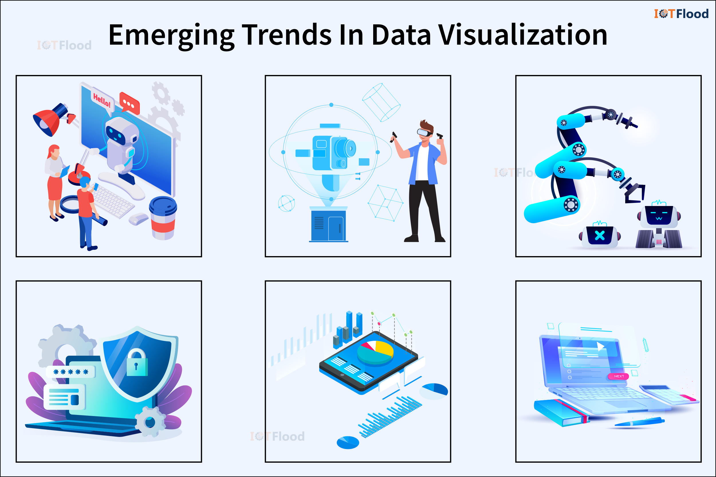
The ever-evolving world of technology is shaping the future of data visualization in several exciting ways:
1. Augmented Reality (AR) and Virtual Reality (VR): These immersive technologies have the potential to revolutionize data visualization. By allowing users to interact with data in three-dimensional space, they enhance understanding and engagement.
2. Natural Language Processing (NLP): Integrating NLP capabilities into data visualization tools makes exploration more intuitive and accessible. Users can interact with the tools using natural language queries and commands.
3. Automated Insights: With advancements in artificial intelligence and machine learning, data visualization tools can now generate automated insights and recommendations. This reduces the need for manual analysis and interpretation.
4. Ethical and Responsible Data Visualization: As concerns about data privacy and bias grow, there is a greater focus on ethical and responsible practices in data visualization. Transparency, fairness, and accountability in data representation are essential.
Challenges in Data Visualization
While data visualization offers numerous benefits, it also comes with its fair share of challenges, particularly when dealing with complex datasets.
Here are a couple of hurdles to consider:
1. Data Quality: It is crucial to ensure that data is precise, comprehensive, and consistent for meaningful visualizations. Inaccurate or incomplete data can lead to misleading visual representations and incorrect conclusions.
2. Interpretation: Successfully deciphering visualizations requires specialized knowledge and analytical skills. Misunderstanding can lead to false assumptions and misguided decision-making.
3. Scalability: Visualizing large and complex datasets is a significant challenge due to limited processing power and memory. Scalable visualization techniques are necessary to handle the increasing amount of data in the digital world.
4. Privacy and Security: Protecting sensitive data from unauthorized access and complying with privacy regulations are important considerations in data visualization. Strong protocols for secure data handling are crucial to safeguard confidential information.
Future Trends
Looking ahead, several trends are shaping the future of data visualization:
1. Technological Advancements: Innovations in machine learning and artificial intelligence are transforming data visualization. These advancements enable automated data analysis, pattern recognition, and predictive analytics, enhancing the capabilities of visualization tools.
2. Real-Time Visualization: The growing focus on real-time data analytics highlights the need for instant visualization solutions that provide up-to-date insights into changing data patterns and trends.
3. Augmented and Virtual Reality: Augmented reality (AR) and virtual reality (VR) are becoming increasingly popular for immersive data visualization experiences.
Ethical considerations have become increasingly important in the field of data visualization, as the widespread use of these tools has raised awareness of the potential ethical issues related to data usage and visualization practices. These considerations, which include protecting data privacy, addressing bias, and promoting transparency, are now an integral part of data visualization methodologies.
Conclusion
In today’s data-driven contexts, data visualization tools are essential because they provide a link between unstructured data and insightful information. Through the utilization of these instruments, people and institutions can unleash the capabilities of their data, attaining a more profound comprehension of patterns, associations, and deviations.
Users can interact interactively with data thanks to the user-friendly interfaces of data visualization platforms, which facilitate real-time exploration and discovery. Furthermore, these technologies’ integration of advanced analytics capabilities enables complex analysis, scenario planning, and predictive modeling, enabling decision-makers to make well-informed decisions based on evidence from data.
Additionally, data visualization tools are effective for communication because they can turn complicated statistics into captivating stories that appeal to a wide range of stakeholders. Users can communicate important discoveries, trends, and insights in an understandable and compelling way by using interactive dashboards, infographics, and visual storytelling tools. This promotes efficient communication with clients, executives, and other stakeholders in addition to improving teamwork and knowledge exchange.
Data visualization tools will be increasingly important in supporting informed decision-making, encouraging innovation, and creating competitive advantage as data continues to multiply in volume and complexity.